Ideas for using background colors and effects
There are many ways to add color and color effects to backgrounds. Here are some ideas.
All of these colors and effects except shape overlays are also available for column backgrounds. Background color and border effects are available in specific modules, such as the Call to Action module.
Solid color
The most basic row or column background is a solid color. Here's an example of a dark blue row background behind a Call to Action module.

Here are a few ideas for variations of the solid-color row background.
Change the opacity
If you're working with a defined color palette, try changing one of the row or column backgrounds in your palette to a slightly lighter opacity. In the following screenshot, the blue color from the previous screenshot is set to 80% opacity for a subtle difference.

If your row has an image background, you can add a color overlay to the row so the color gets dark or lighter and makes text easier to see, as in the following screenshot.
Add a gradient
You can use color gradients in row backgrounds. Here's an example of the Call to Action module surrounded by a radial gradient.

You can also generate sophisticated gradients at third-party sites and add them with CSS. Here's an example of a gradient with a pattern:

Add a row shape overlay
You can add a shape to a row edge that is anchored in relation to the top or bottom border of the row. You can style and transform the shape in various was, such as flipping horizontally and vertically and changing the Y offset, so you can place the shape overlay just about anywhere in the row and give it some interesting effects.
Here's an example of a concave overlay at the top border with a semi- transparent background color and radial gradient overlay that creates something of a halo effect. The background image is fixed, so the overlay allows the trees to peek through in the halo area as the page is scrolled.

Add a border and/or border effects
You can add a border and round the border corners or add a border shadow to any row, column, or module that has a Borders section.
Here's an example where the border is made a bit more interesting by using 5px on the left and top side and 10px on the right and bottom side.

In the following screenshot, a radius and shadow have been added in the same blue color as the row background.

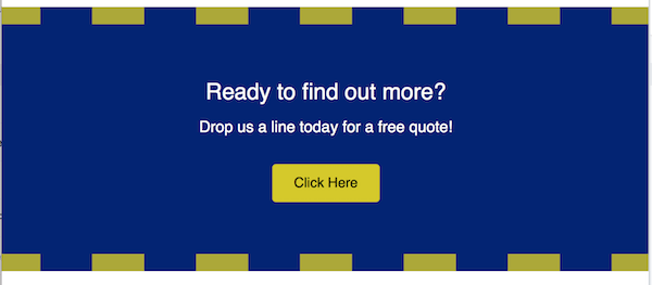
Or you can make a border style become part of the design. In the following example, there's a 20 px upper and lower border of the same color as the button, set to Dashed and 80% opacity. To compensate for the large border, the row padding is increased to 40px. Notice how the bold effect draws the eyes toward the call to action.
Add texture
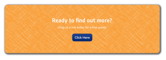
Row backgrounds with both color and texture become even more interesting. The best way to add texture is to use an image for the row background. Choose Photo instead of Color in the row settings.
Here's an example of an image with color and texture used as a background. This example has no border, but radius and shadow border effects were also applied to soften the corners.
Set off content with a background in a column or module
No matter what type of row background you have, you can add a color background to a column (or sometimes a module). In the following screenshot, a semi-opaque background color was added to the Call to Action module.
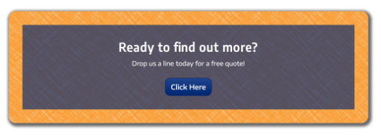
If another background like an image completely hides the background color, the color may still be visible briefly while the image is loading.
Color overlays
If you're using an image or video as a row background, you can improve the legibility of text by using a background overlay color. For example, the following screenshot shows the difference in the legibility of the text without a row background overlay and with a row background overlay set to black (#000000) at 50% opacity.
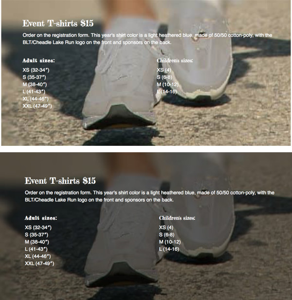
As an alternative, you can set a background color on the column. In the following screenshot, the column has a background color set to #333333 at 50% opacity. You can vary the exterior and interior size of the column with margin and padding settings.
